
Website margins too large
R
Rachel Gholson
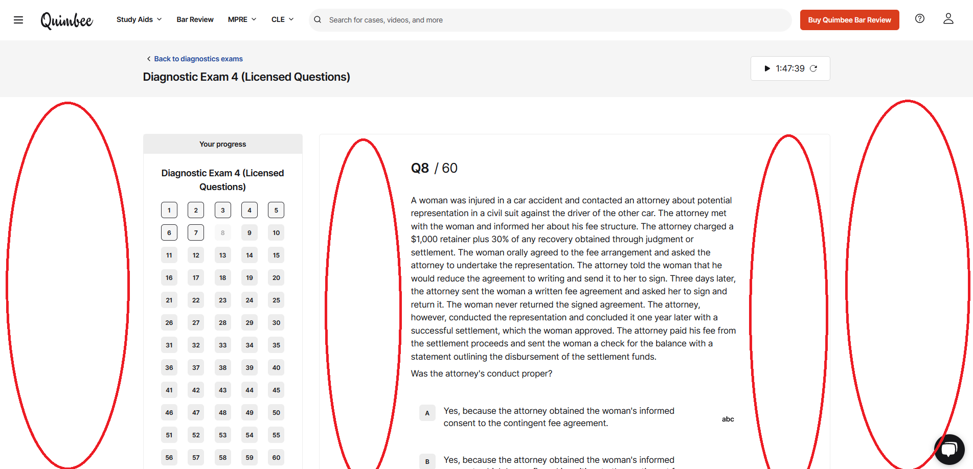
All content screens have such large left and right margins. There is so much space on the screen that is not being used. This is annoying in case briefs, but especially so when taking any diagnostic (see screenshot). You have to zoom out so far to see the question and answer choices on the same screen, which would be unnecessary if there weren't so much unused real estate. Even justifying the questions would alleviate some of this. Please decrease the margins so you don't have to constantly scroll.
Log In